
Visual design & art for small game development projects.

Too Hot Outside
Co-Game Designer, Co-Coder and Artist
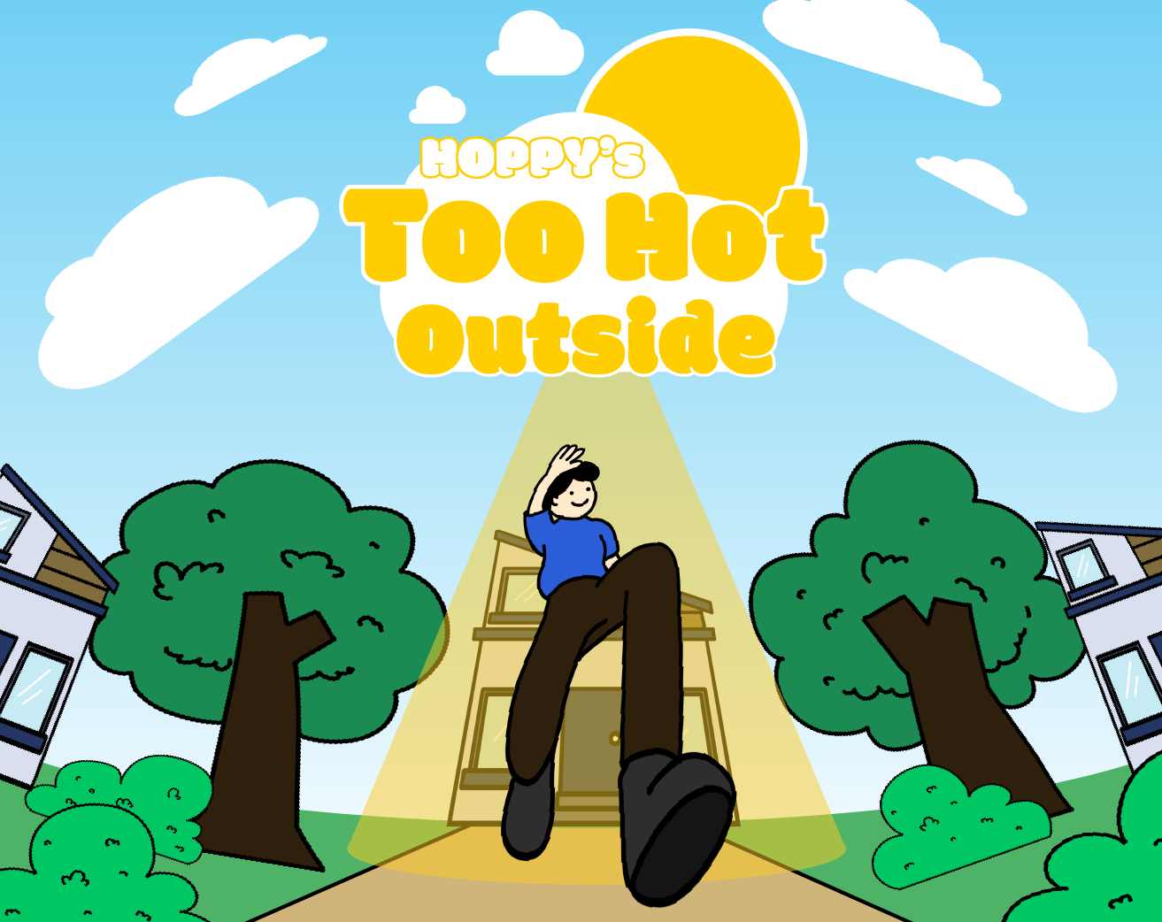
For Too Hot Outside, I worked as the main artist, creating the game’s visual assets and overall art direction. I also contributed as a co-coder and co-game designer, working with the team to develop gameplay mechanics and bring the project together from both a creative and technical perspective.
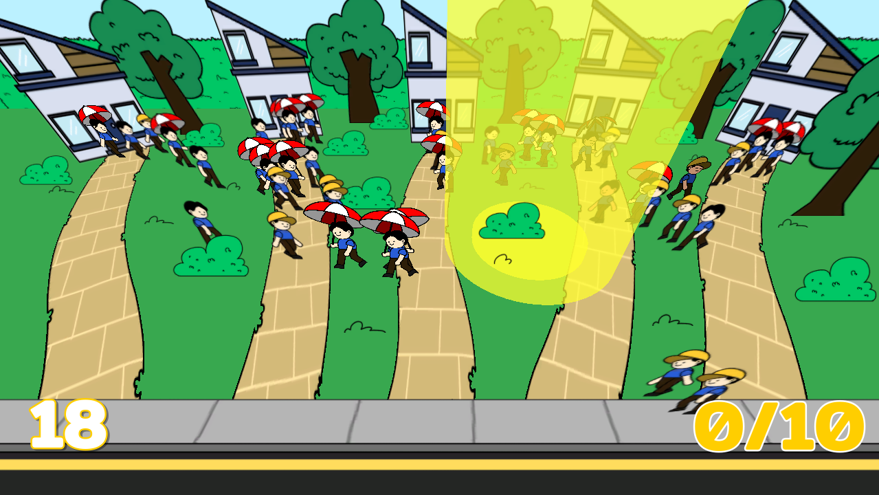
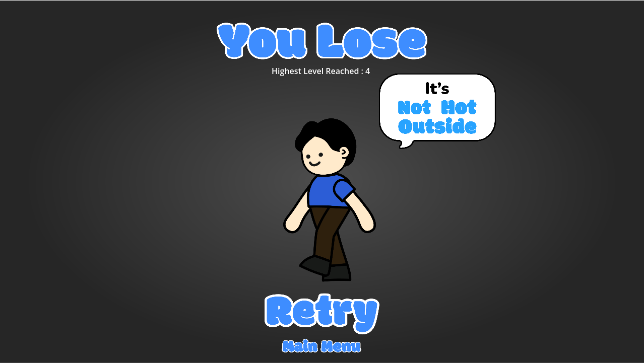
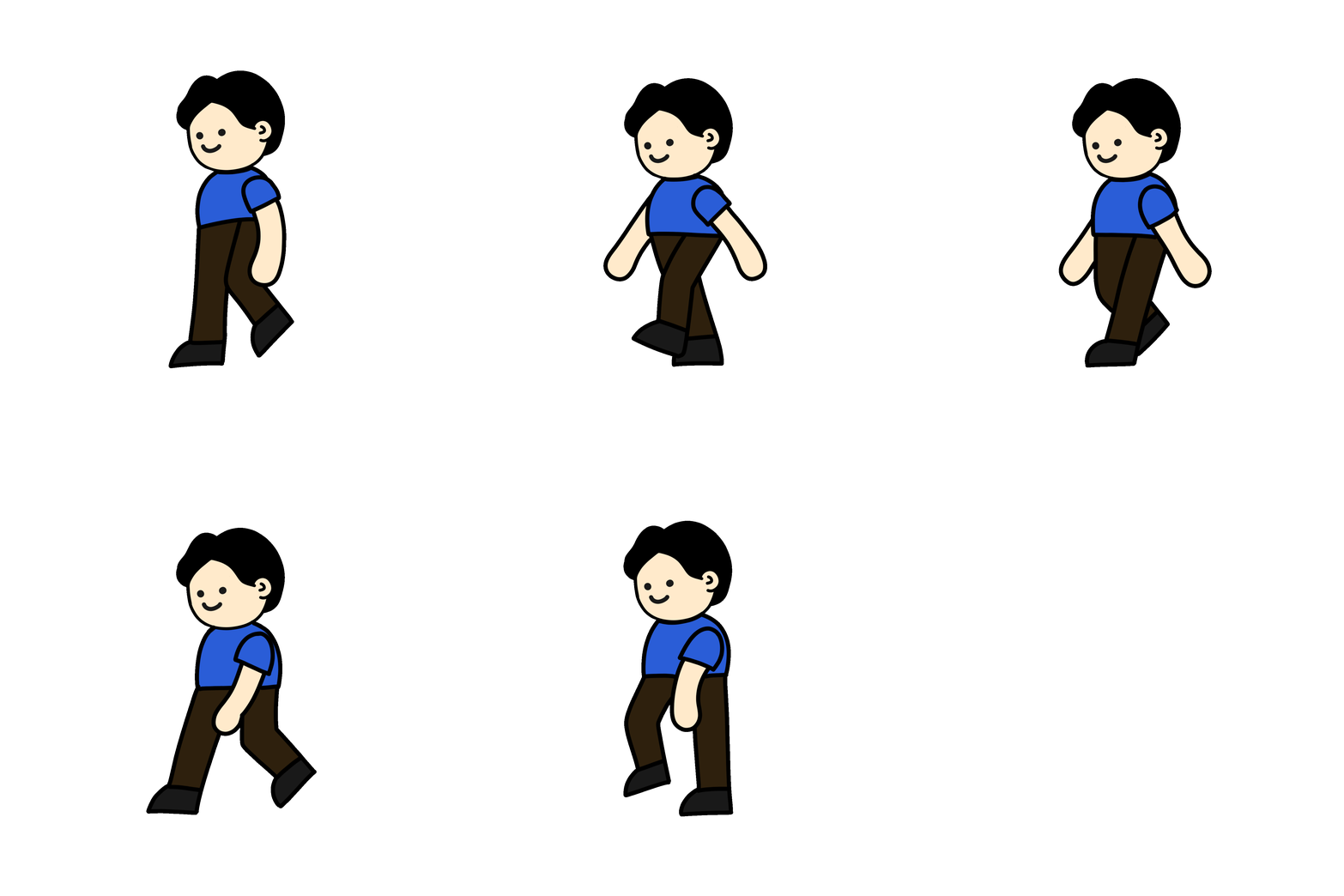
Game Assets
Overall Art Directions
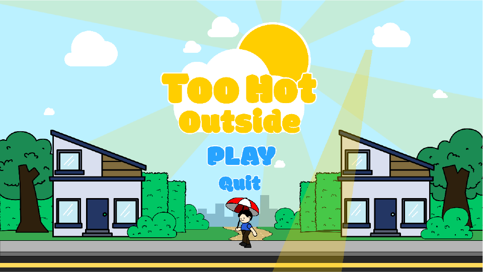
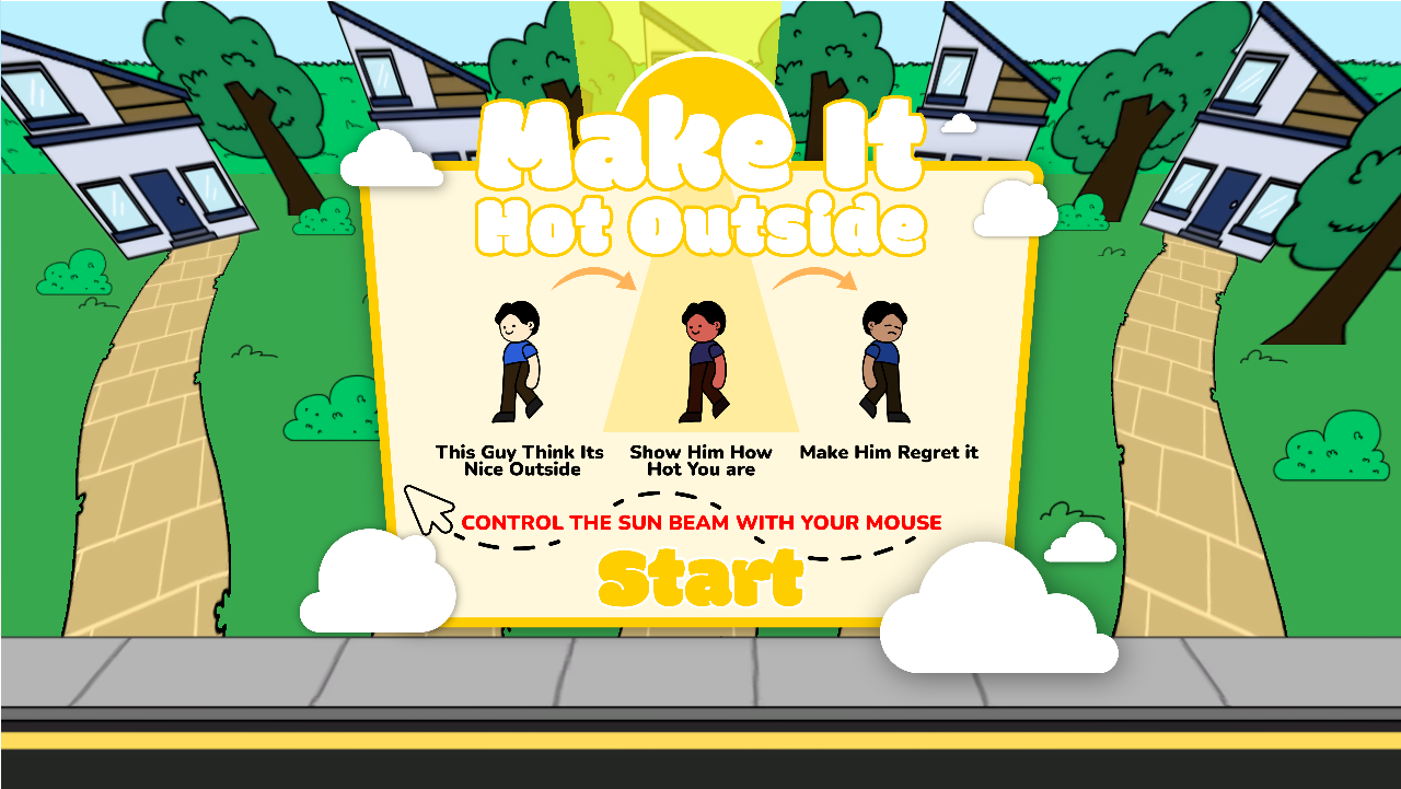
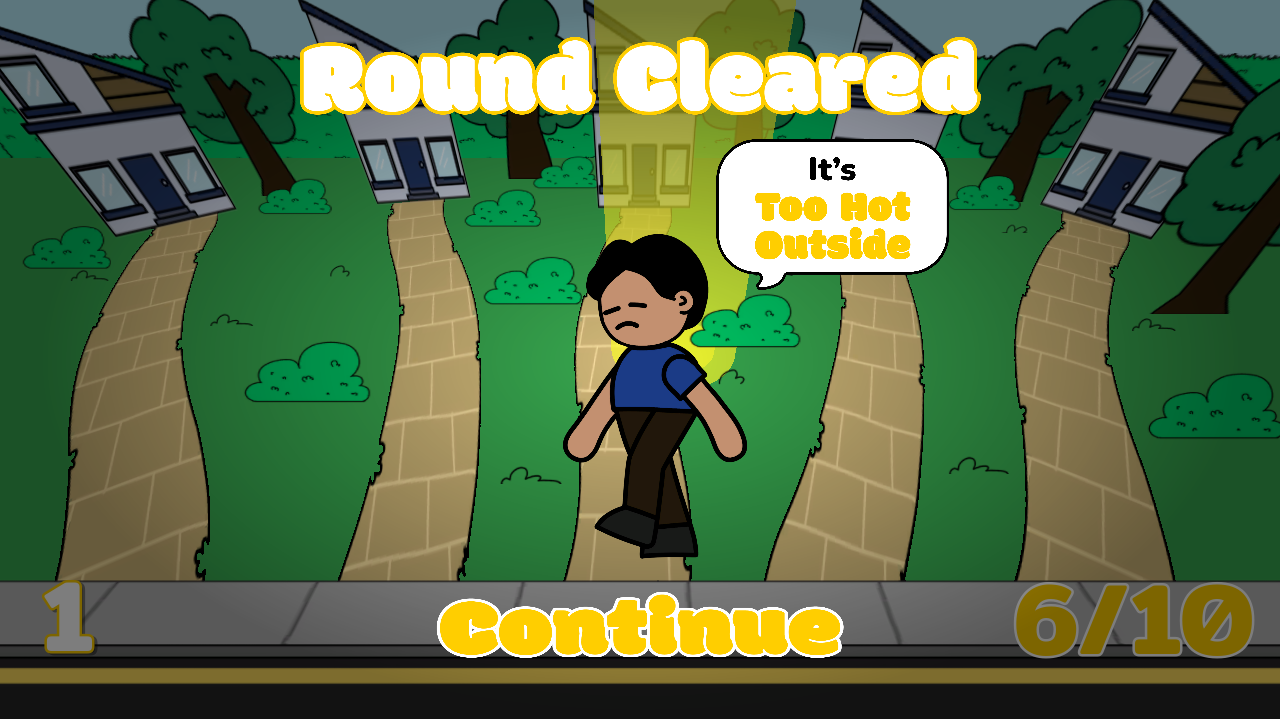
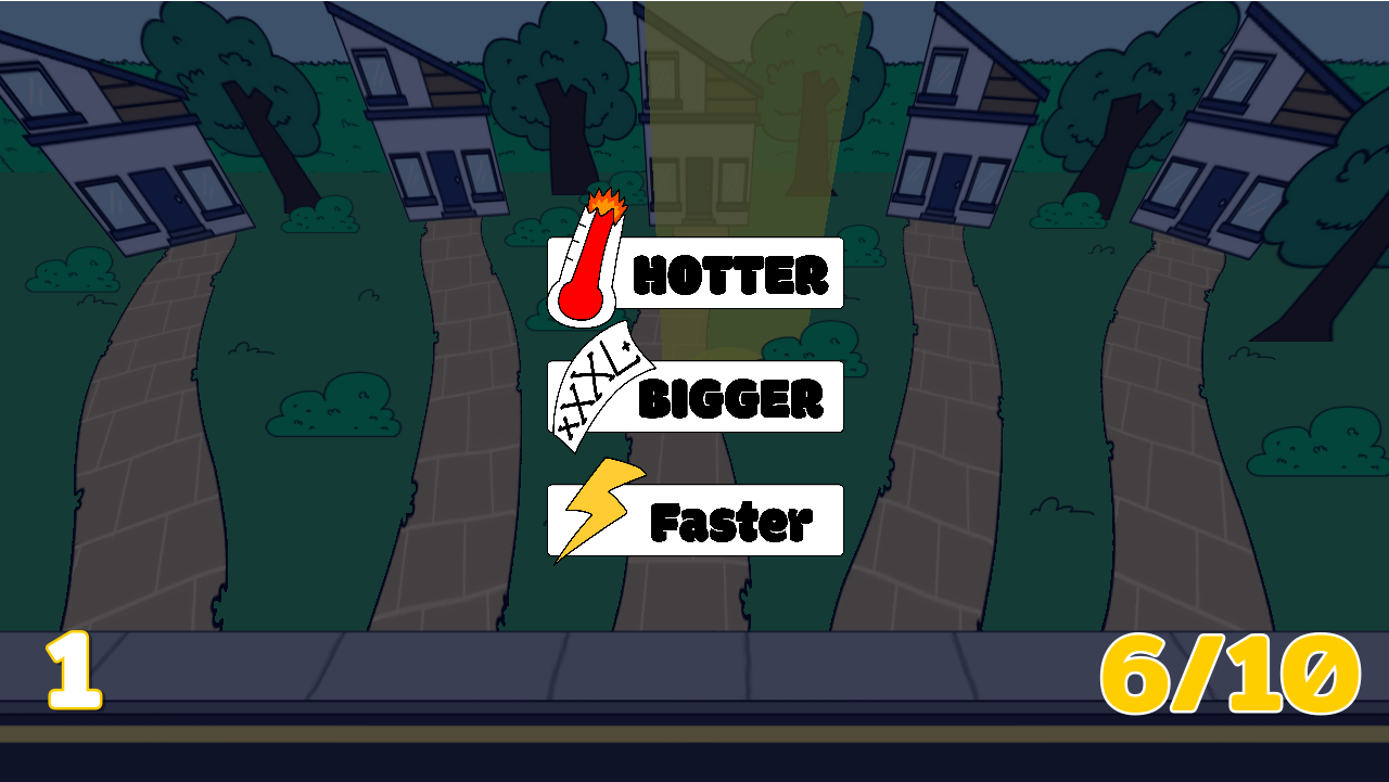
The overall art style of Too Hot Outside is inspired by hand-drawn illustrations and children’s colouring books. I used bold, playful shapes and bright, highly saturated colours to create a cheerful and approachable visual style. Combined with the bubble-like typography, the art direction gives the game a fun and playful summer atmosphere.
Enemies
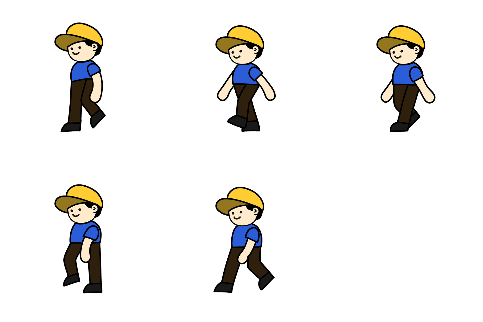
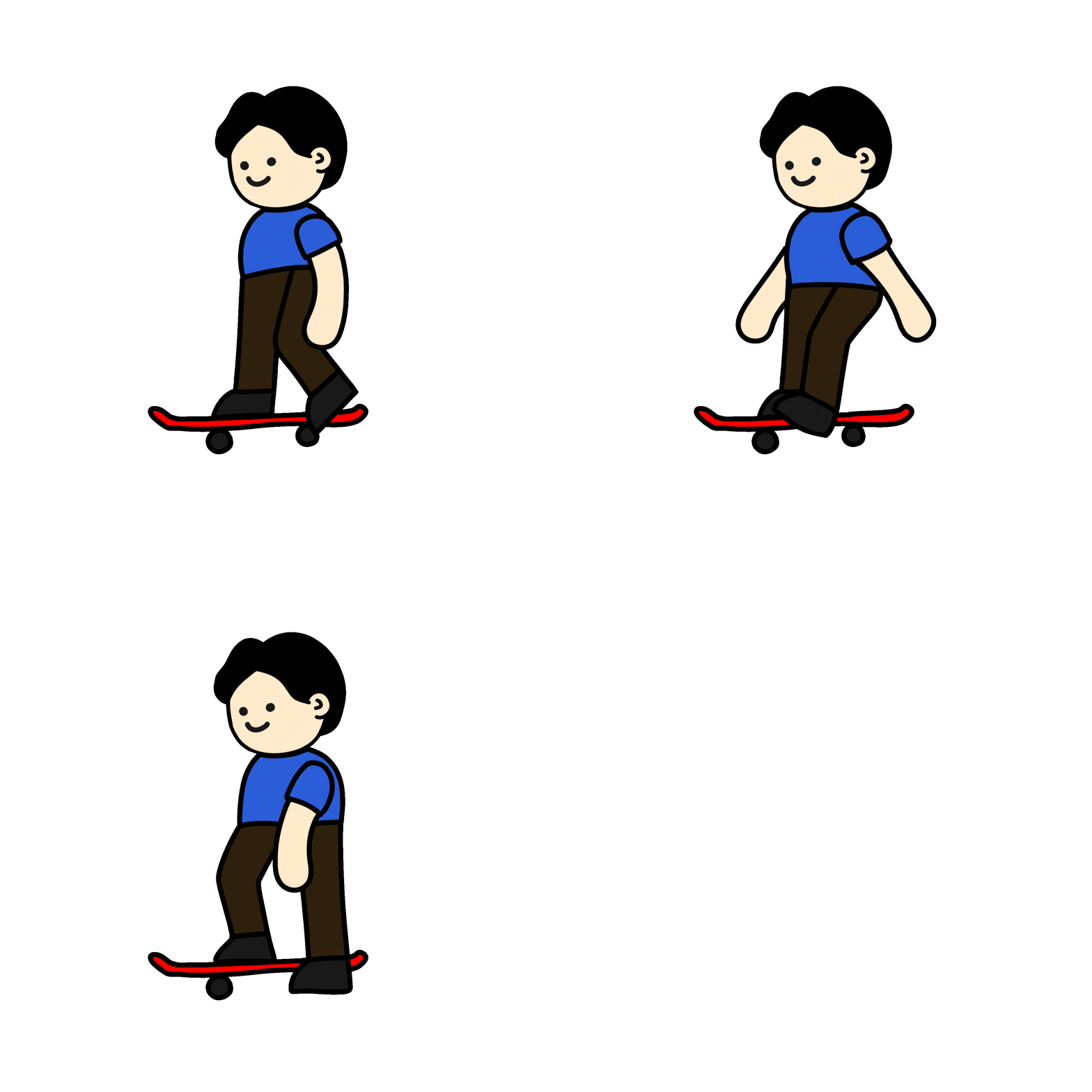
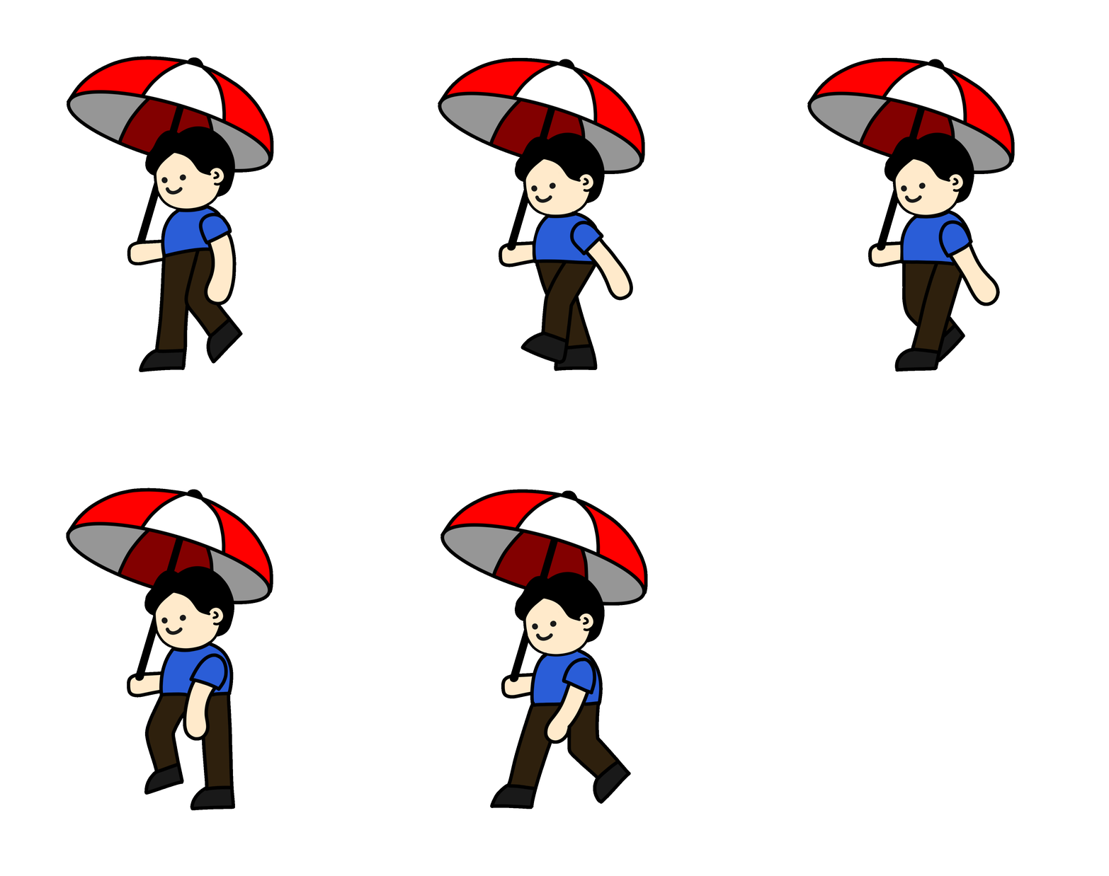
The enemies in Too Hot Outside are designed as ordinary people simply going about their daily lives. Each enemy has a more “elite” variation, using accessories to visually communicate their characteristics and gameplay role. The hat-wearing peeps have better protection from the sun, giving them more HP than the standard peeps. The sketchboard peep has no protection, but makes up for it with increased speed. Meanwhile, the umbrella peep has the most protection and highest HP, but sacrifices speed in return.
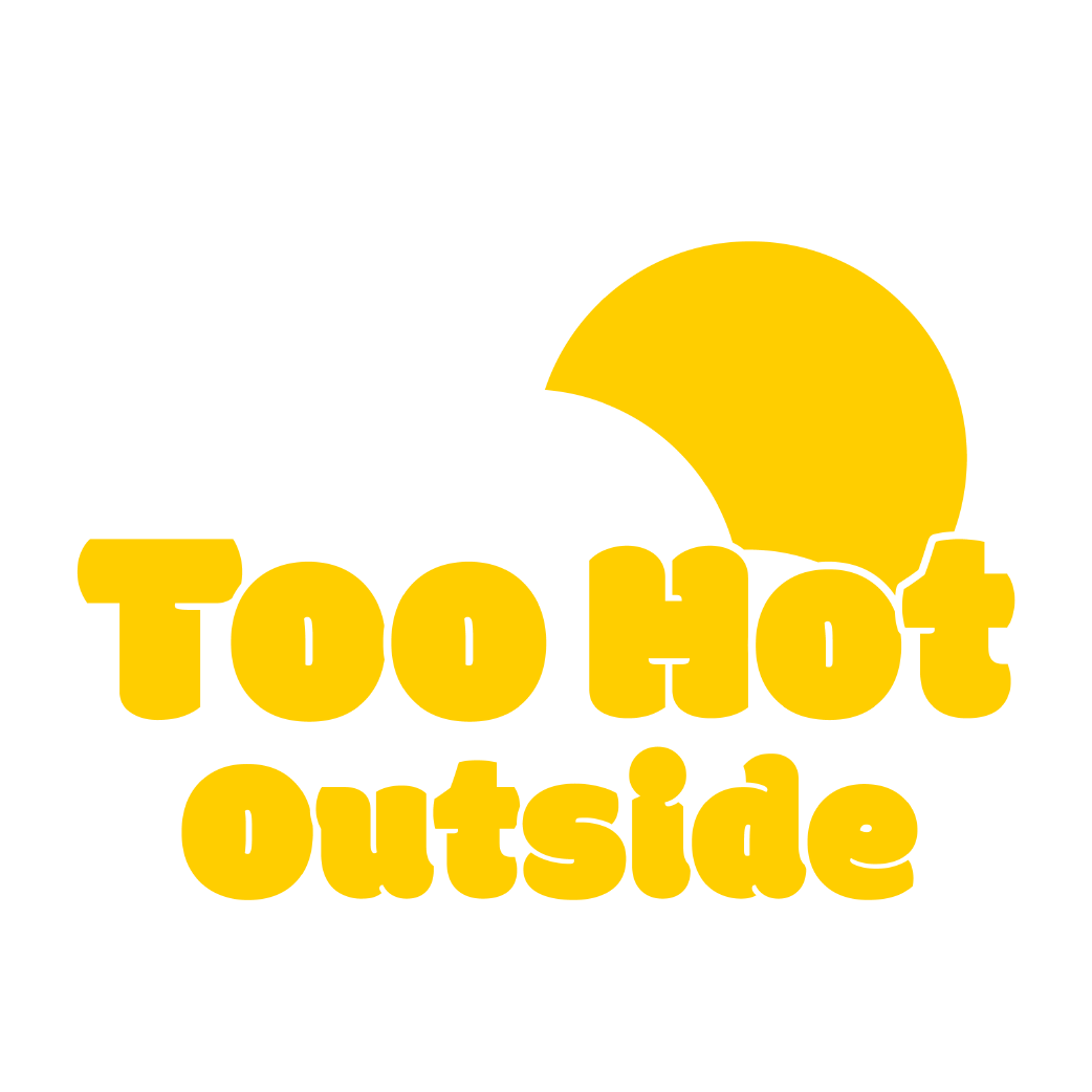
Typography
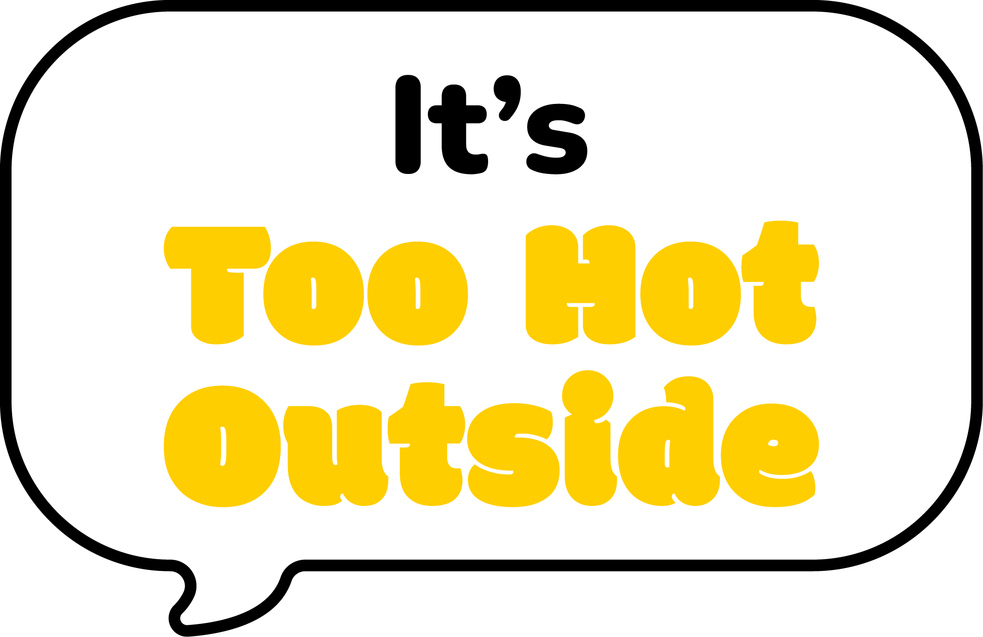
The typography in Too Hot Outside is designed to capture the bright, fun feeling of summer. I used a warm, beach-inspired colour palette to reflect the outdoor setting, while the rounded, bubble-like font adds a playful and friendly character to the game’s visual identity.
NAKKA
Graphic Designer
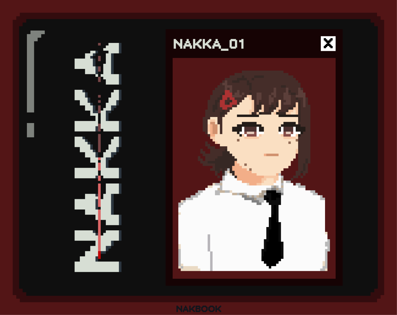
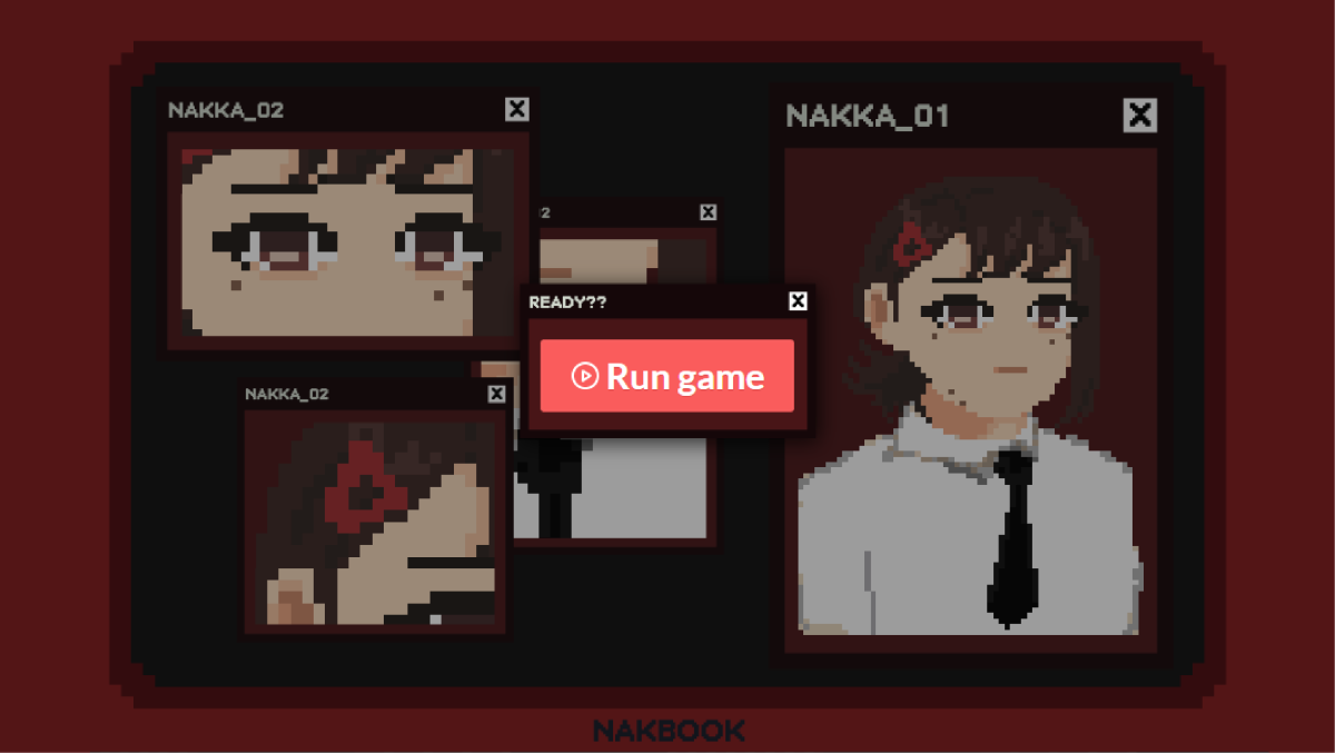
My involvement in the NAKKA project was different from my other game projects. I worked primarily as a graphic designer, providing artwork and visual assets for the team rather than contributing directly to the game’s development. This project also gave me the opportunity to explore pixel art for the first time, using Aseprite to create the game’s pixel-based graphics.
Game Assets
Overall Art Directions
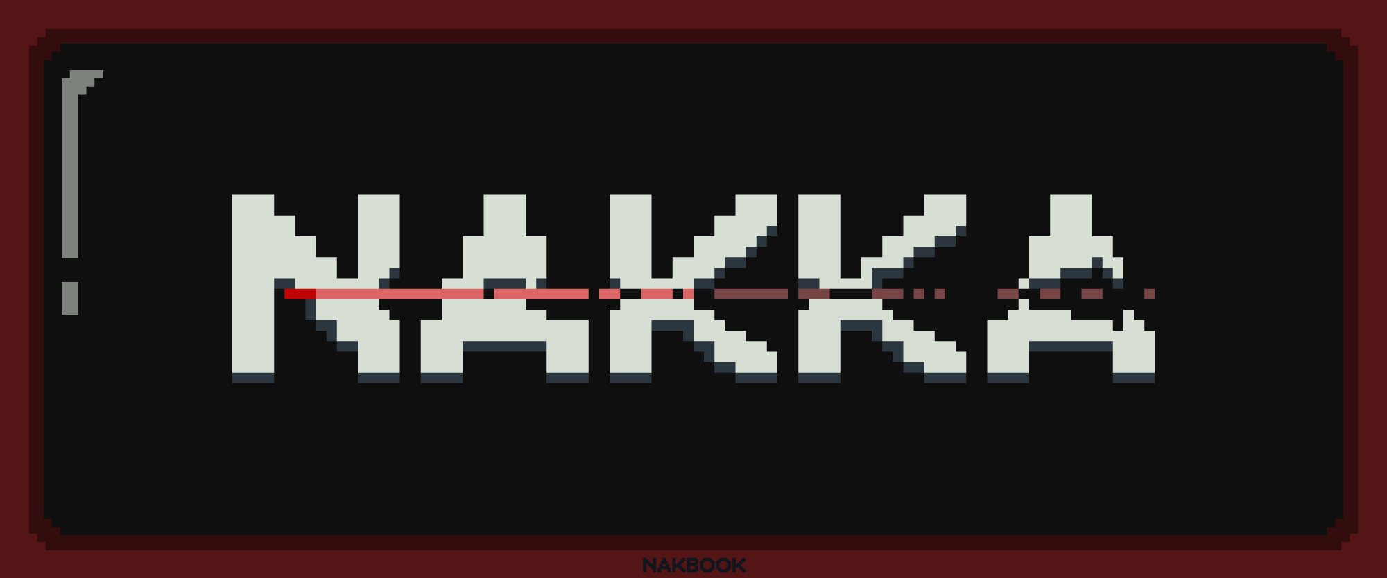
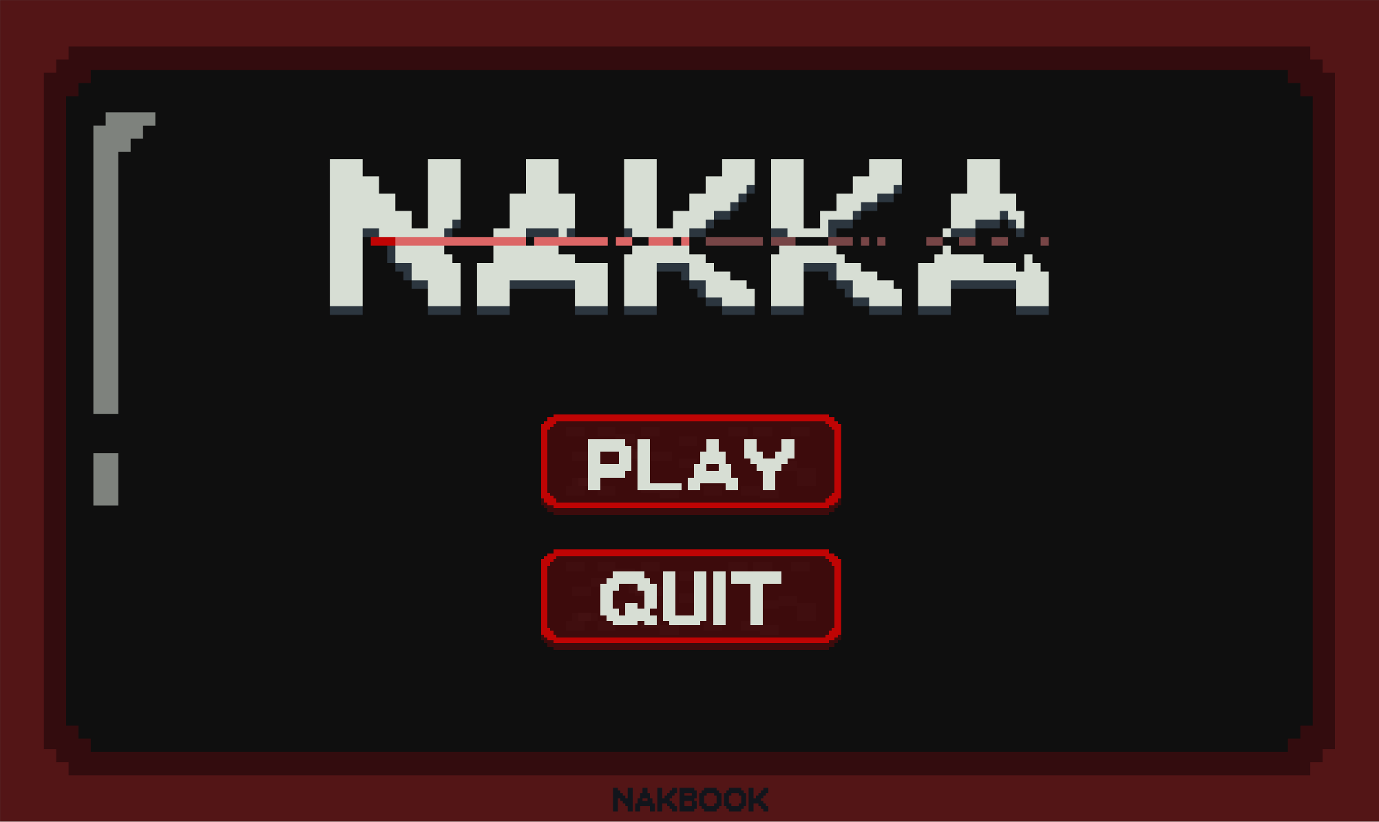
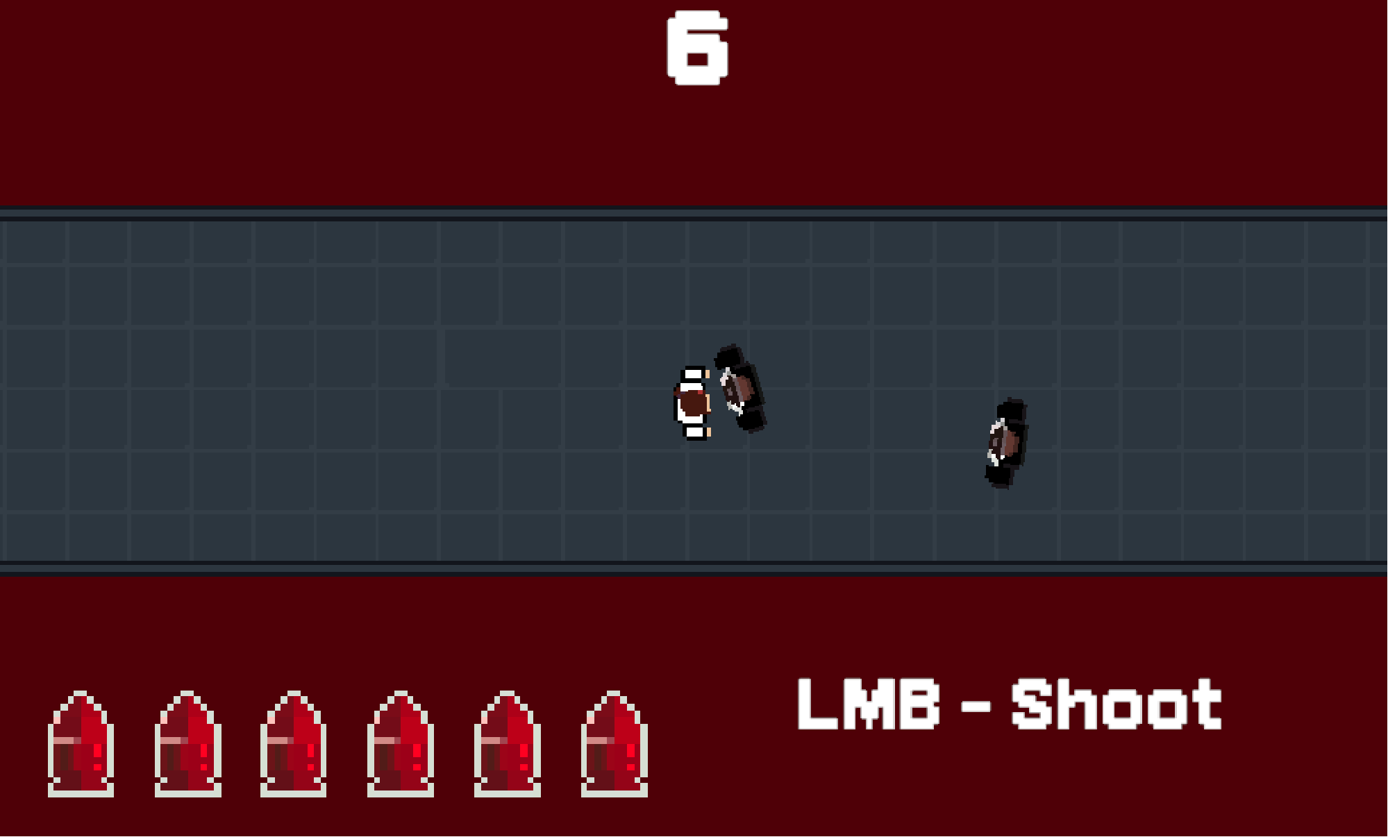
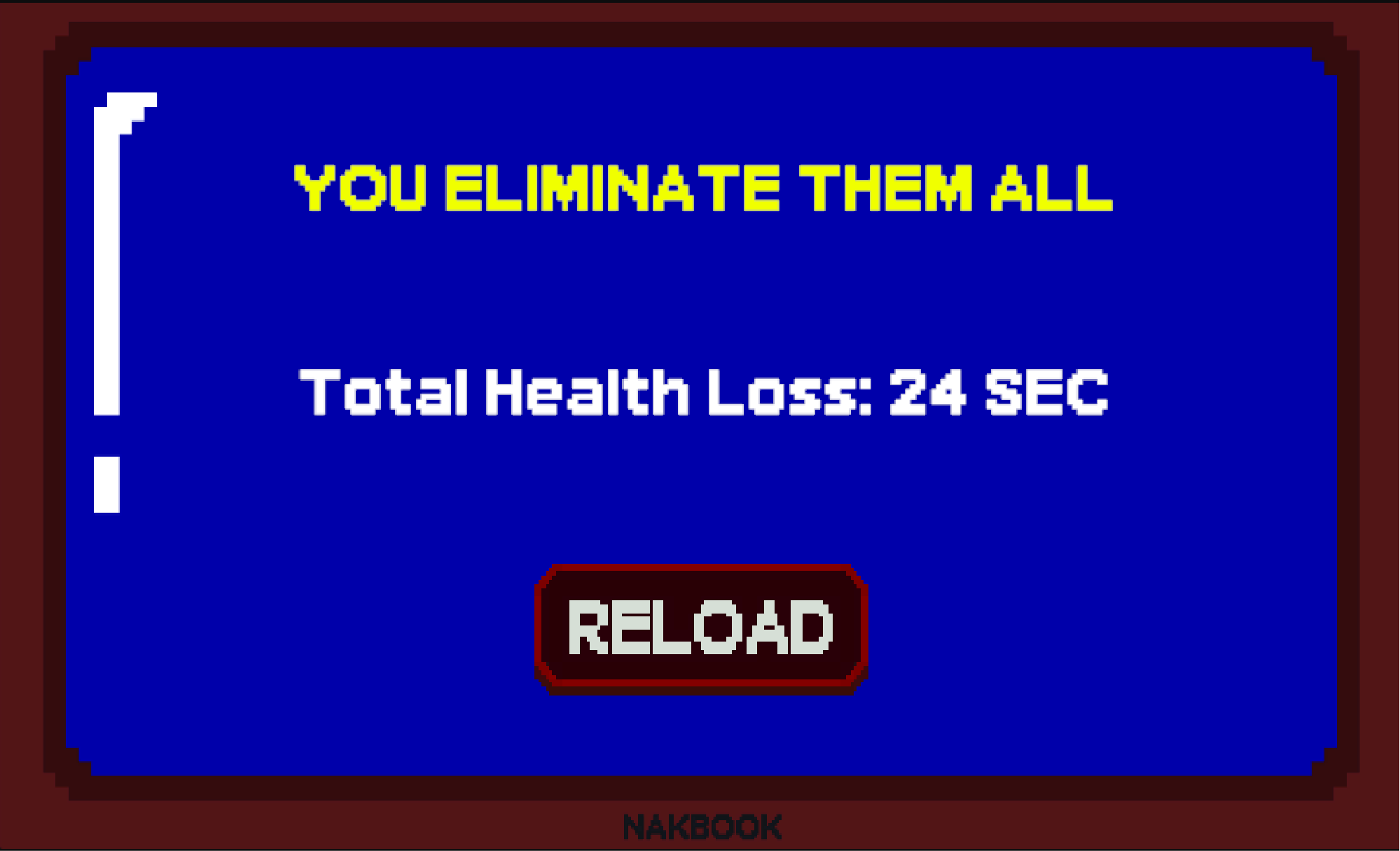
NAKKA was the first game where I explored pixel art using Aseprite. The visual direction was built around a “killer office” theme, with the colours and artwork designed to create an unsettling yet playful atmosphere. The Windows XP-inspired interface further reinforces the office setting, giving the game a nostalgic computer aesthetic that fits its overall theme.

Bounty Snatchers
Co-Game Designer, Ui Designer and Graphic Designer
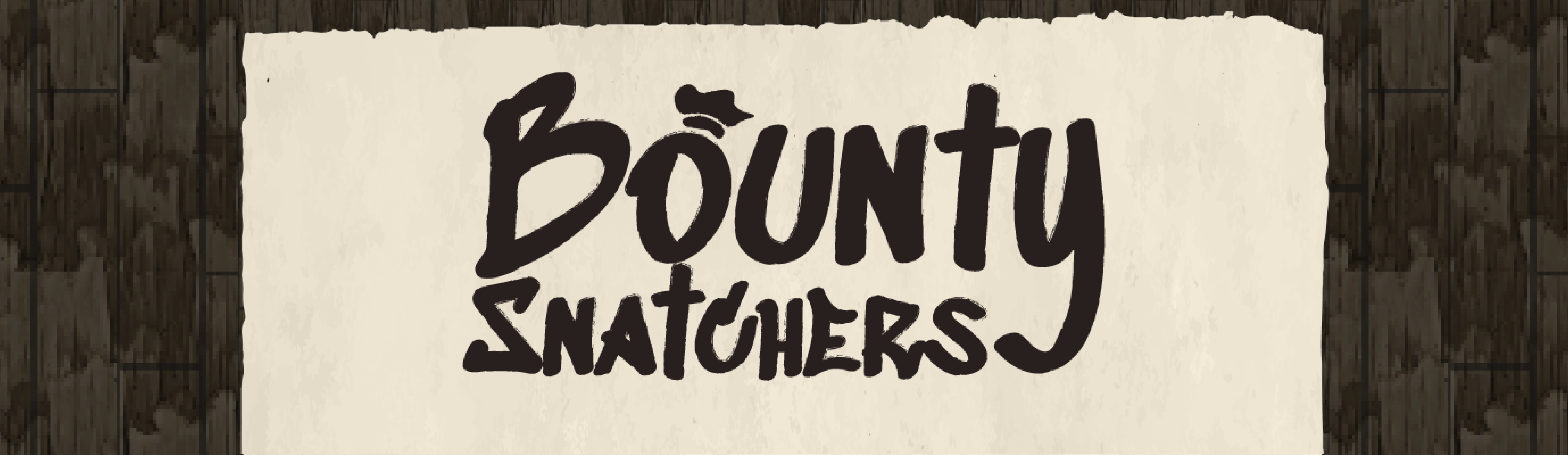
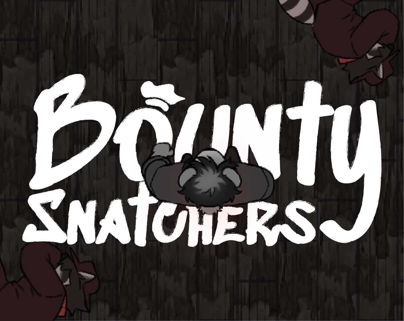
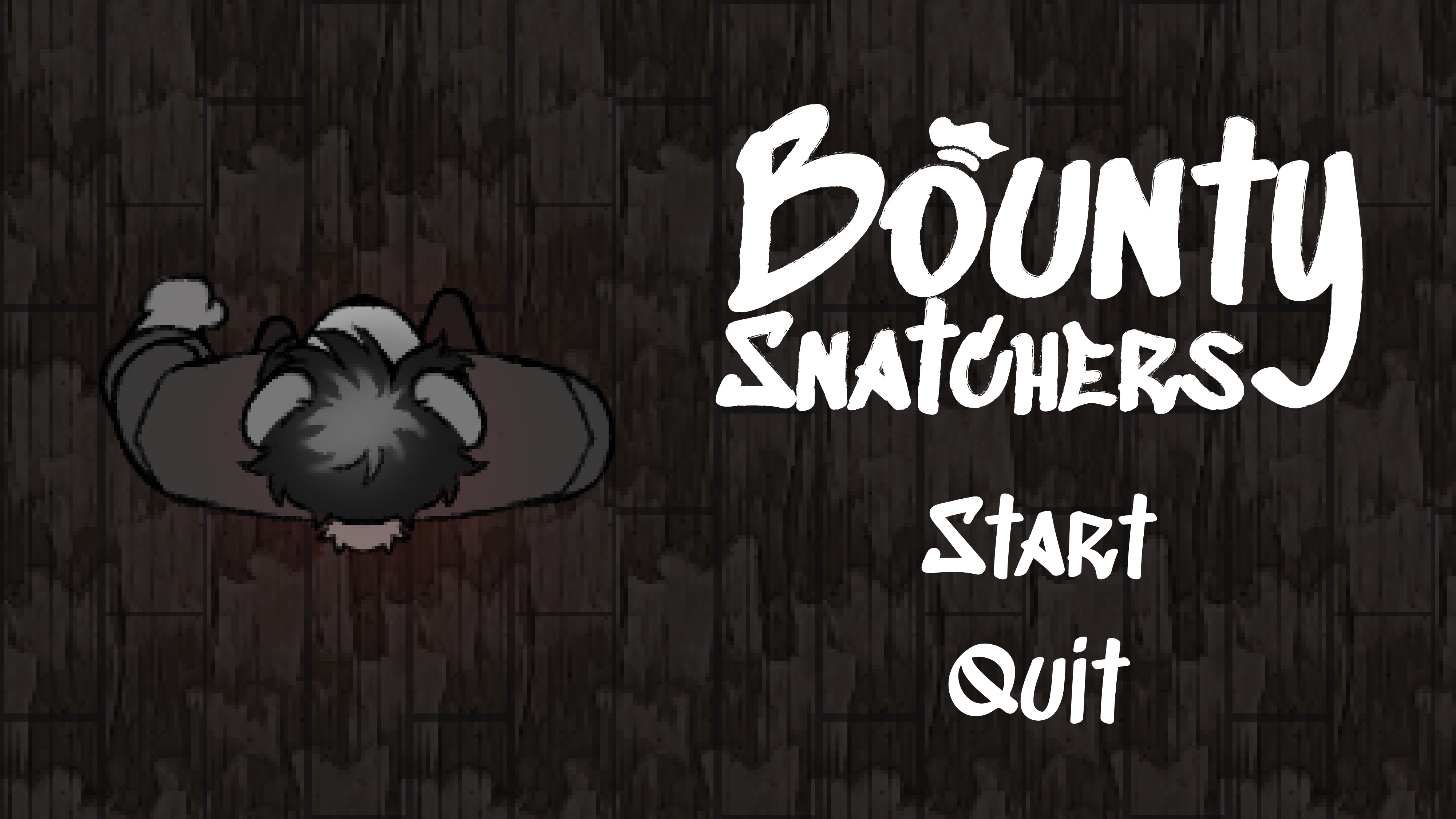
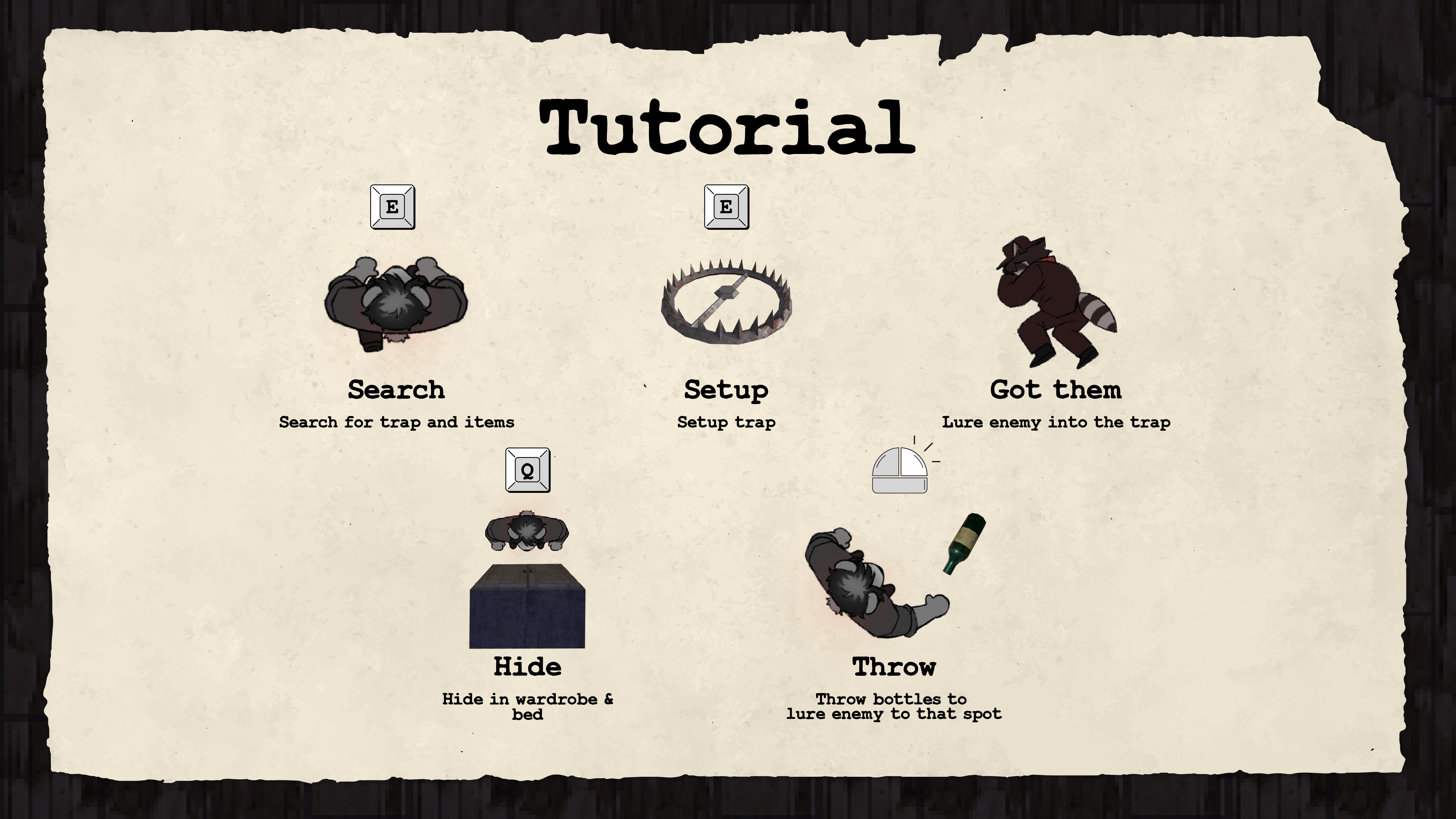
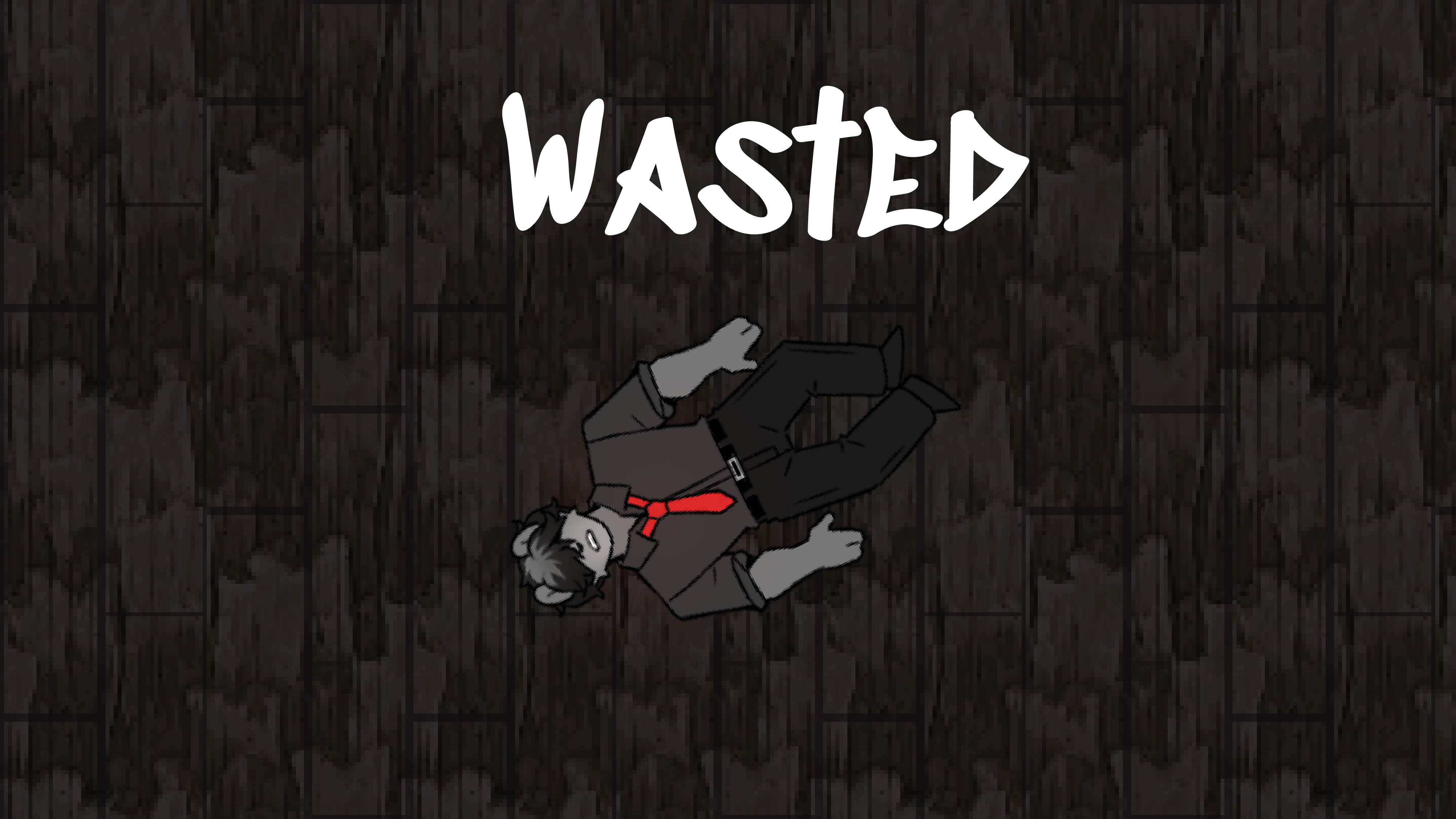
As a co-game designer and 2D artist for Bounty Snatchers, I handled the game’s graphic direction, logo, UI, and tutorial screens. I worked closely with the team to create a cohesive visual identity that supports the gameplay, while the character and 3D assets were created by other team members.
Game Assets
Overall Art Directions
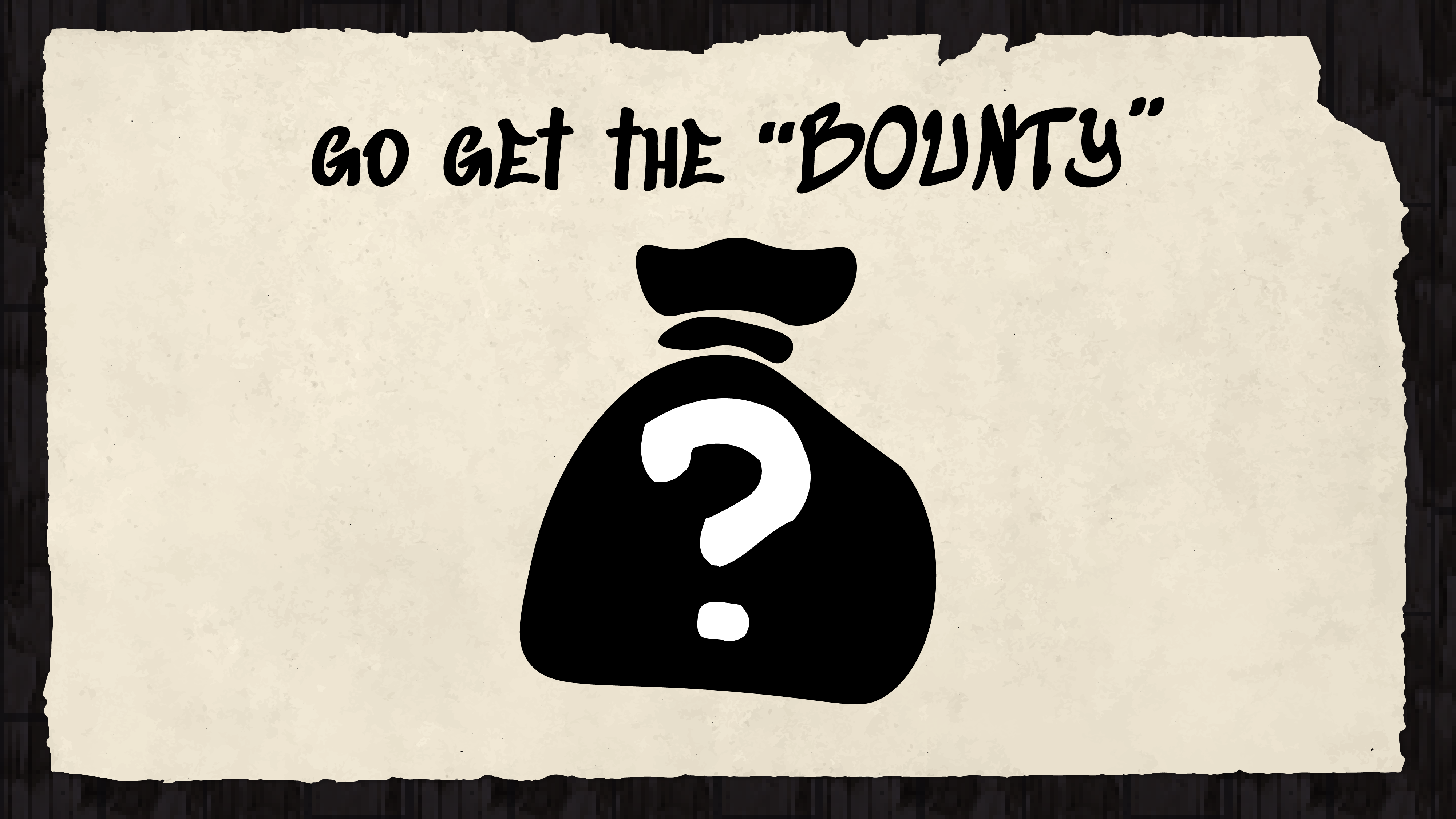
The overall art direction of Bounty Snatchers is built around a stealthy woodland cabin setting, with a playful and unexpected twist. To make the game information feel like part of the world, I presented important instructions and clues as pieces of paper that the player discovers, as if they were found in the trash. The cartoon-inspired visual style complements the characters created by my team and helps balance the stealthy atmosphere with a sense of fun.
Typography
The typography in Bounty Snatchers is designed to resemble handwritten text, helping it feel more natural and personal within the game’s world. This hand-drawn style supports the game’s playful, cartoon-like aesthetic while reinforcing the atmosphere and character of its setting.